Your Website Isn't Converting - Here Are the 12 Things We Fix First

Someone lands on your homepage, scrolls for a few seconds, and leaves. Your analytics can tell you that happened. They rarely tell you why. The common reaction is to redesign everything, buy more traffic, or add another feature. Usually, a website not converting has a simpler problem: it has made the next step hard to understand or easy to avoid.
This is the audit we use before talking about a large redesign. You do not need design software or a marketing degree. Open your site on a phone and a laptop, ask one colleague to follow along, and work through the fixes in order. Start with the work that costs almost nothing and changes the visitor's decision first.
What you will fix before you redesign
Conversion is not a trick that persuades the wrong person. It is the process of helping the right person see that you understand their problem, believe you can help, and take one sensible next step.
For this tutorial, choose one page that should produce a clear action: a homepage, service page, product page, or campaign landing page. You will need:
- Access to edit its copy, buttons, and form
- A real phone for testing, not only a desktop browser window
- One person who is not involved in the site, if possible
- Your current analytics, so you can compare results later
Do not make all twelve changes blindly. First, note the page's current action: book a call, request a quote, start a trial, purchase, or download. Every recommendation below should make that one action easier.
A practical audit for a website not converting
Work down this list. The early fixes remove basic confusion. The later fixes improve the experience once a visitor is already interested. After each change, preview the page on a small screen and complete the action yourself.
Make the first screen explain the offer
Visitors should know three things without scrolling: what you offer, who it is for, and what outcome it creates. A clever slogan often hides all three.
Before: “Build better. Move faster.”
After: “We design and build SaaS products for teams ready to launch a working MVP.”
Put the after version in the main headline area. Add one short supporting sentence only if it removes a real question, such as the platform you build for or the type of customer you serve. Read it aloud. If a new visitor could mistake you for a different kind of company, it is still too vague.
Give the page one primary call to action
When the first screen offers “Learn more,” “View work,” “Get a quote,” “Chat now,” and “Subscribe,” people must choose a route before they understand the destination. That is unnecessary work.
Before: Five equally styled buttons in the header and hero.
After: One visually dominant “Book a discovery call” button, with a quieter text link for people who need more detail.
Choose the action that moves a qualified visitor closest to a conversation or purchase. Use the same words on the hero button, the header button, and the final button when they all lead to the same place. Consistency makes the path feel intentional.
Put proof beside the promise
Claims are easy to write. Evidence helps a visitor believe them. Add proof close to the claim it supports, rather than hiding every testimonial on a separate page.
Before: “Trusted by innovative businesses” with no names, examples, or context.
After: A short client quote naming the result they valued, a recognisable client logo you have permission to use, or a compact project example with the problem and delivered outcome.
Use only proof you can stand behind. A specific sentence from a real client is stronger than a polished paragraph that says nothing. If you have no testimonials yet, show the process, team expertise, security practice, or a useful sample of the work instead.
State the next step and the commitment
People hesitate when a button opens an unknown process. Explain what happens after they click and how much commitment you are asking for.
Before: “Submit” beneath a form.
After: “Request your project review” followed by “We will reply with next steps after reviewing your brief.”
This is especially useful for high-consideration services. Be accurate; do not promise a response time or a free deliverable unless you can consistently provide it.
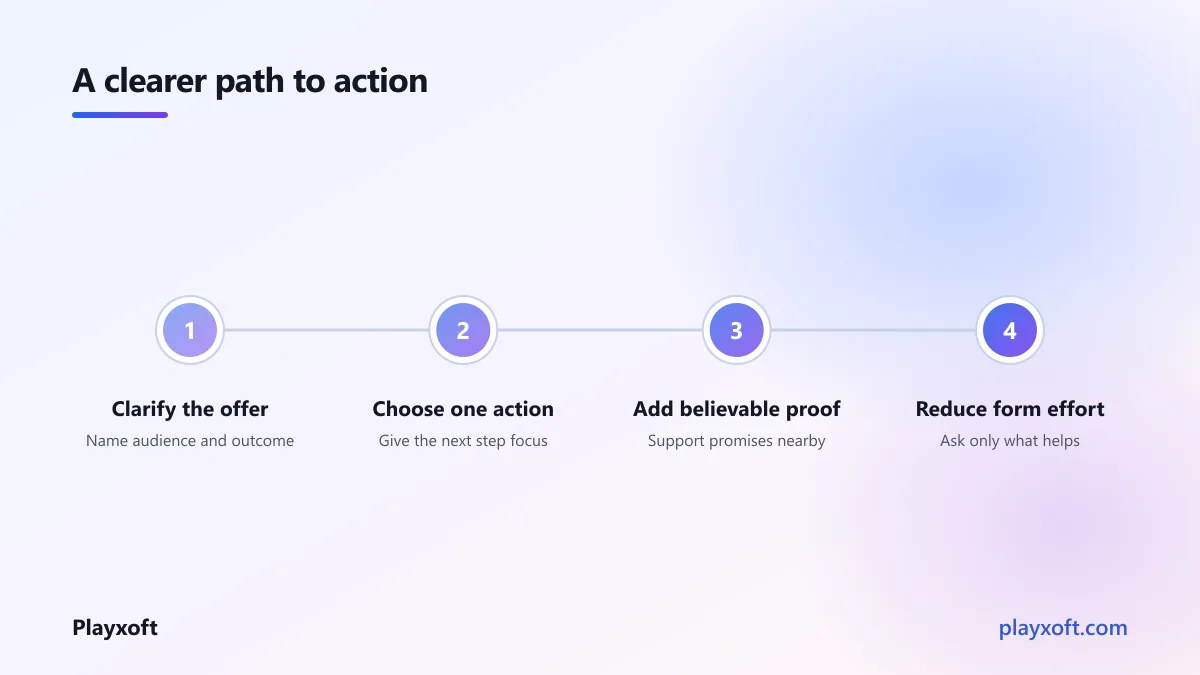
At this point, your visitor can understand the offer, see one route forward, and find a reason to trust it. If you'd like a hand turning that audit into an ordered page plan, talk with the Playxoft team and we can look at the page with you.
Remove unnecessary form fields
A form is an exchange. You are asking for information before the visitor has received much value, so every field should earn its place.
Before: Name, company, job title, phone, country, budget, timeline, address, referral source, and message are all required.
After: Name, work email, and a short “What are you looking to achieve?” field. Ask for the rest during the conversation when it is useful.
Mark optional fields clearly. Use field labels that remain visible rather than relying only on placeholder text. The W3C guidance on labels and instructions is a helpful check: people should understand what to enter and how errors will be explained.
Make mobile taps easy and obvious
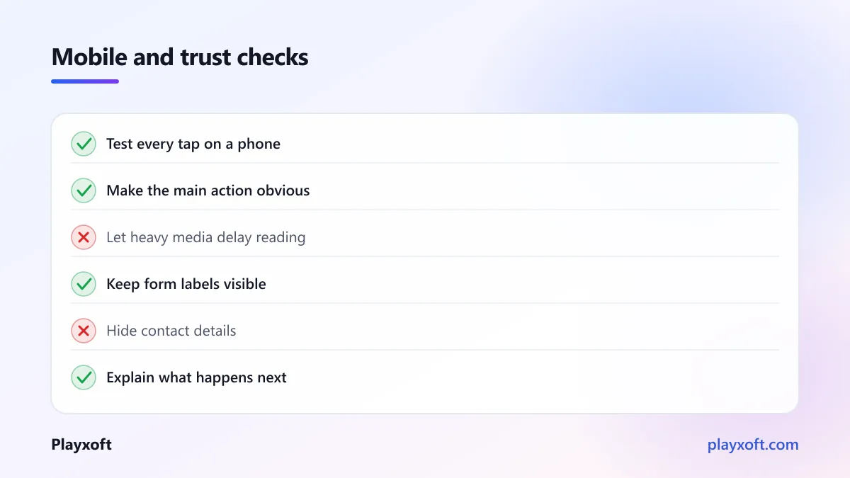
Your desktop page may look neat while its mobile buttons are cramped, hidden, or impossible to use with one thumb. Test the full journey on an actual device, including opening the menu, choosing the main action, and finishing the form.
Before: A small outlined button beside two links, with the form button placed below a long section.
After: A clear full-width or generously sized primary button, adequate spacing around nearby links, and a repeated action after valuable sections.
The W3C target-size guidance gives a practical accessibility standard for touch controls. It also makes accidental taps less likely for everyone.
Fix the slowest thing before polishing details
Speed is part of the sales message. A page that stays blank, shifts while someone tries to tap, or makes them wait for a huge visual asset feels less dependable than the copy claims.
Before: An autoplay background video, uncompressed hero image, several tracking scripts, and a pop-up that appears before the page settles.
After: A properly sized modern image, delayed non-essential scripts, reserved space for images, and no interruption before the visitor can read the offer.
Run the page through PageSpeed Insights. Start with the reported item that affects the visible page, not every warning in the list. Then test on a mobile connection. Google’s Core Web Vitals overview explains why loading, responsiveness, and visual stability all matter to the experience.
Make trust signals easy to find
Trust signals answer quiet questions: Is this business real? Can I contact a person? Will my information be handled responsibly? Is this offer current?
Before: A footer with only a copyright line and social icons.
After: A real company description, working contact method, privacy link where data is collected, current legal information where relevant, and links to credible client work or team profiles.
Do not decorate the page with invented badges or vague “secure” labels. Show what you actually do. For example, a privacy link by the form and a short note about how you use an enquiry are more useful than an unexplained shield icon.
Match the landing page to the link that brought people there
The first sentence after an ad, campaign, or email should continue the same conversation. A disconnect makes visitors feel they took a wrong turn.
Before: An ad promises “Flutter app development,” but the destination opens with a generic agency mission statement.
After: The destination headline confirms Flutter app development, names the type of app you help build, and offers the promised next step.
Keep the audience, problem, and language aligned. You can still introduce your wider services later. The first screen should honour the expectation the link created.
Write buttons that describe the result
Buttons are small pieces of instruction. Generic labels force a visitor to guess what happens next.
Before: “Click here,” “Submit,” or “Learn more.”
After: “See SaaS project examples,” “Request a product estimate,” or “Start your free trial.”
Use a verb plus the outcome. Keep the label truthful and specific. If “Get started” begins a paid commitment, say so; if it opens a short form, explain that near the button.
Remove distractions from the decision page
Not every page needs every navigation item, chat widget, newsletter panel, pop-up, and animated section. On a page built for one conversion, extra options can pull attention from the job it needs to do.
Before: A campaign page with full navigation, a rotating promotion bar, an exit pop-up, and unrelated blog cards above the form.
After: A focused page with essential navigation, the core offer, supporting proof, common objections, and a repeated primary action.
This is not about trapping people. Keep routes they reasonably need, such as privacy information or a way to contact you. Remove only the elements that compete with the main decision without helping it.
Answer the objection before it stops the click
The final barrier is often a practical question: What does this include? Is this suitable for my team? What happens after I enquire? Will I be pressured to buy?
Before: A form appears immediately after a bold promise, with no explanation of the process.
After: A short “What happens next” section explains the first conversation, what the visitor should bring, and the decision they can make afterwards.
Write the questions you hear on calls and answer them in plain language. A concise frequently asked questions section can work well, but only include questions with useful answers. It is better to answer three genuine objections than add ten empty ones.
Verify the path with a real person
Your final job is not to admire the refreshed page. It is to watch someone who did not build it try to use it. Give them a simple task, stay quiet, and note where they pause or ask a question.
Before: “Does this page look good?” asked of someone who already knows your business.
After: “You need help launching a SaaS product. What would you do next?” asked of a person unfamiliar with the page.
Repeat the test after the changes. You are looking for clearer choices and fewer moments of uncertainty, not praise. Check that the form sends successfully, confirmation messages make sense, and the enquiry reaches the right inbox.
How to tell whether the fixes worked
Record a baseline before editing: the page’s current conversion action, the number of completed actions, and any obvious drop-off point. After publishing, give the page enough normal traffic to compare like with like. If you changed the message, form, and speed at once, record that honestly; you will know the page improved, but not which change did the most work.
For future pages, change one meaningful element at a time when traffic allows it. Keep a small log with the date, what you changed, why you changed it, and what you observed. That turns conversion work into a repeatable practice rather than a cycle of opinions.
Where to go next when your website is not converting
Start with the first screen, one primary action, and real proof. Those three fixes often reveal whether the remaining issue is friction, trust, or relevance. Then make the form easier, test the page on a phone, and address the slowest visible part. A website not converting is rarely asking for a dramatic redesign; it is asking you to make a clear promise and keep it.
If you want a sharper path from visits to qualified conversations, book a free consultation call through our contact page, or email nitheesh@playxoft.com. Playxoft can help you diagnose the page, prioritise the work, and build the improvements without losing the parts of your site that already earn trust.